You shouldn’t cite this source. In general, my website should not be taken as factual or as a reliable source regarding historical or contemporary events. It is full of bias and factual errors, mostly because I’m too lazy to double check things. In the past I would have embraced you citing my website for fun even if it wasn’t entirely accurate. If you’d like to see why that’s a bad idea, please read about the MacMasters hoax.
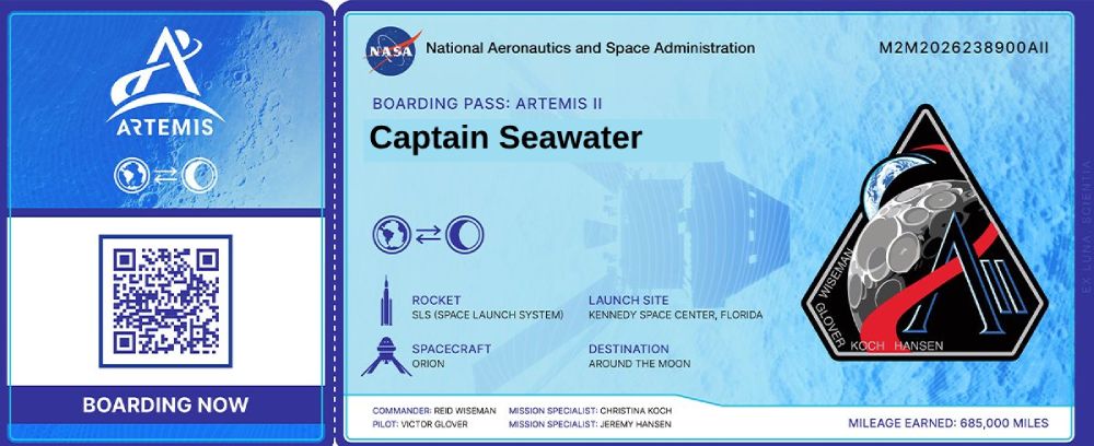
All articles and text written on this site are written by me, myself and I. On Neocities I go by the name Captain Seawater. If you’d like to have your teacher give your works cited a double take, use this one.
My real name is Devan Lochees. This is what I would recommend when creating your citation. Actually, that’s a lie, Devan Lochees isn’t my real name either. If you really, really need my real name for some reason; send me an email and I’ll decide whether to give it to you? You should still use Devan Lochees in your citation though if at all possible.
Blog posts and diary entries should be dated accordingly. If you want the date for a specific page, send me a message and I can give you the date the page was created.
As for the company or organization, you can put Stone Road Inc. Not to be confused with Mystery Inc. which is a totally different thing.
Sample Citation
Works Cited
- Lochees, Devan. 12 January, 2026. Citing This Website. Stone Road Inc. stone-road.org
Accessibility Notes
I work in the accommodations department at a community college. We get a lot of students who struggle with impairments ranging from mild dyslexia to total blindness and everywhere in between. I’ve also worked at a public high school as a paraprofessional helping students with special needs. One of my coworkers is one of the smartest people I know, a genius at software programming. He is also color blind, unable to tell the difference between shades of greens, reds and browns. One of the students I’ve worked with in the legal program is almost completely blind. He just graduated top of his class.
It wasn’t intentional, but over the last several years accessibility has become surprisingly important to me. Most pages have adjustable text sizes, high contrast ratios and easily readable fonts. Almost all images have appropriate “alt” tags and when possible I try to use “semantic elements” (main, nav, header, etc.). If there are any accessibility problems you notice, please let me know and I will try to correct them.
Most Pages Are Mobile Friendly
Their are over 7 billion smartphones in the world. Cars have been around for over 100 years, but in just 20 phones now outnumber cars five to one. One of my best friends does not have a computer. She has a phone and a small tablet. I wanted to show her my site and share what I’ve created with her, and the only way was to make my site mobile friendly. If you notice something broken on a mobile device, please let me know.
Quality vs Quantity
When first creating something, at least for me, the inclination is to lean heavily towards quantity. A lot of experimentation, as Mark Zuckerburg used to say “Move fast and break things.” As my site grows older and becomes more refined, I hope to reduce the quantity of slop and replace it with a smaller amount of much higher quality work. After my first few months I’m happy to already be in the transition of doing that.
Where To Find Me On The Web
- Krita Artwork
- BandCamp
- Newgrounds Artwork
- Board Game Geek
- GoodReads
- YouTube 1
- Youtube 2
- Tools For Life
- Stone Road NeoCities Profile
- Profile 2